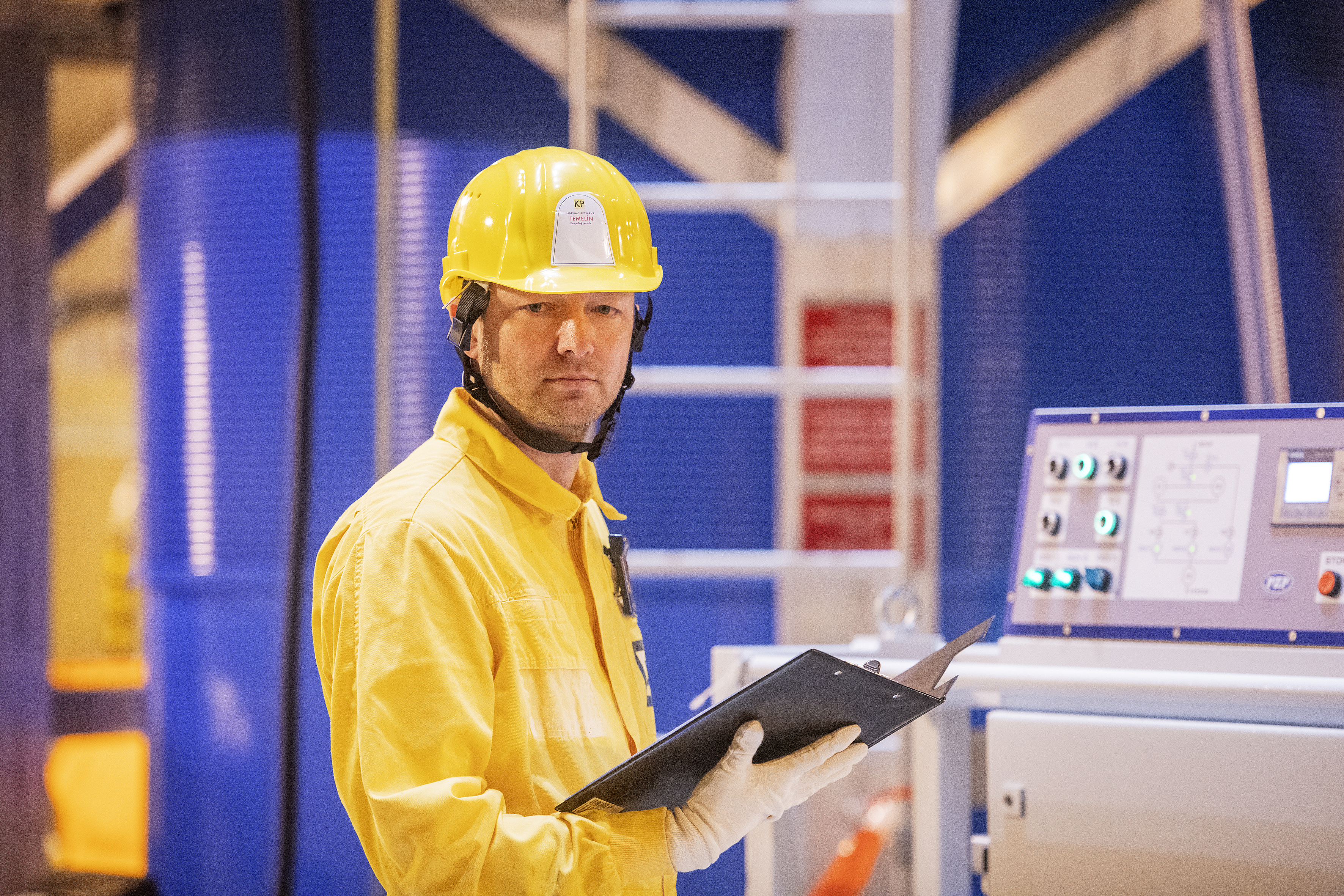
Some of the best projects are those where we can make a real difference. Not just inventing a new thing, but having to tie it to history, to an established culture, to tread carefully around a precious brand.
Such was the ŠKODA Nuclear Engineering identity project. A company with global reach, billions in sales, a 60-year history, the heritage of the disintegrated Skoda brand, 1,200 employees and a desire to be rightly seen as a leader in its field.

We have helped with a new perception of themselves. From dozens of hours of workshops and conversations across the company (vertically and horizontally), we distilled a brand mantra: We are the power of nuclear engineering.
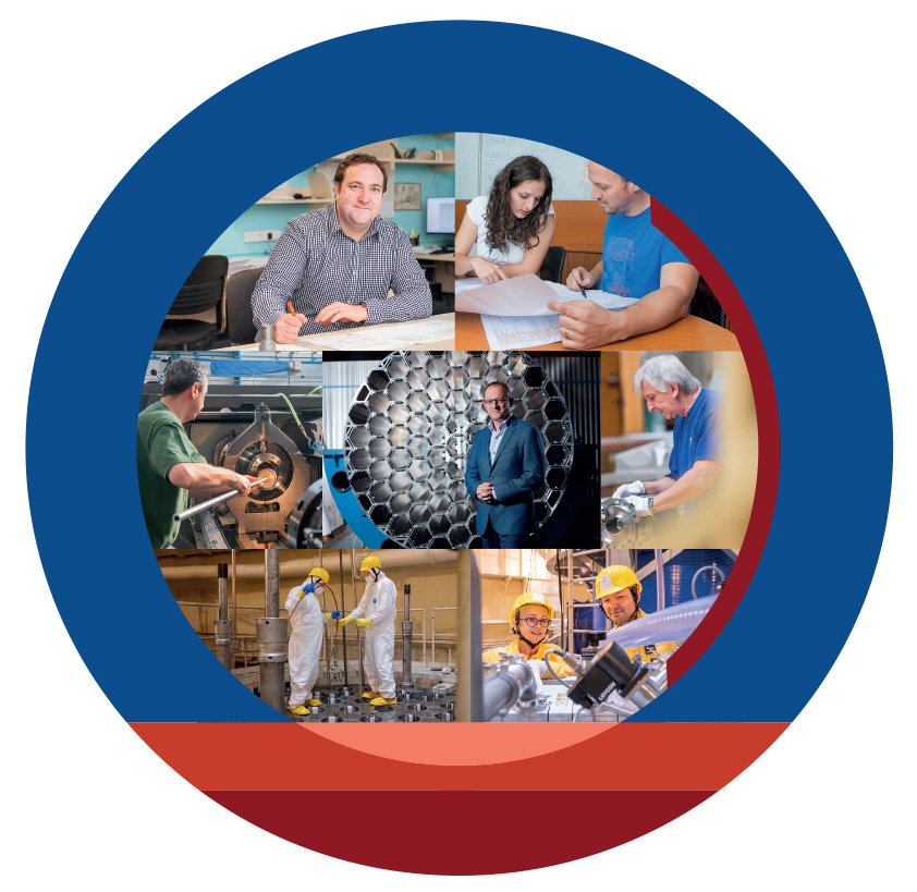
Suddenly, it was established that nuclear engineering, safety and the sustainability of nuclear power in this country and in Europe cannot do without the deep knowledge, generational experience and innovation of the people at ŠKODA JS.
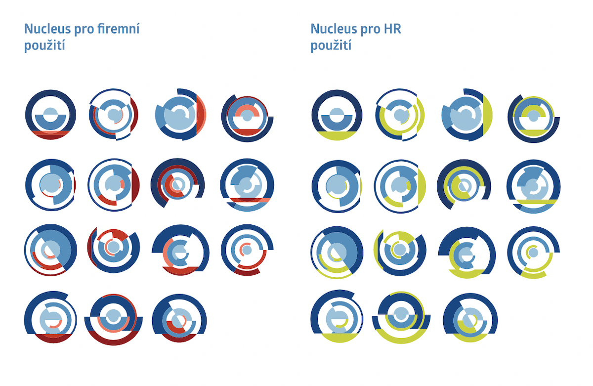
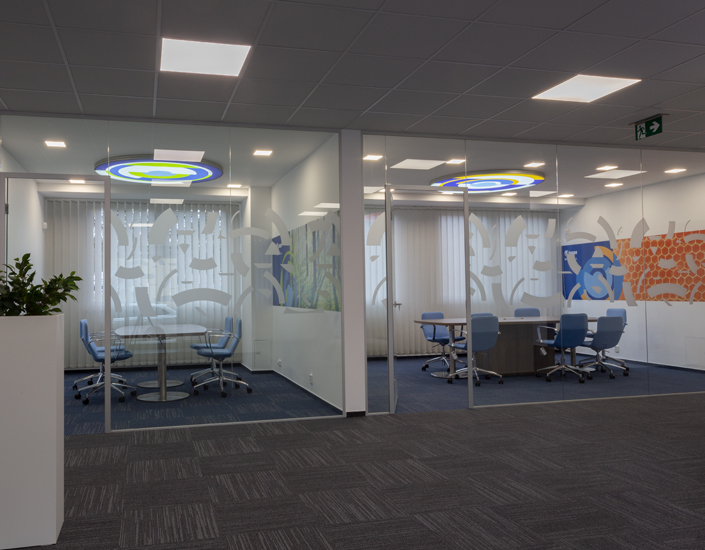
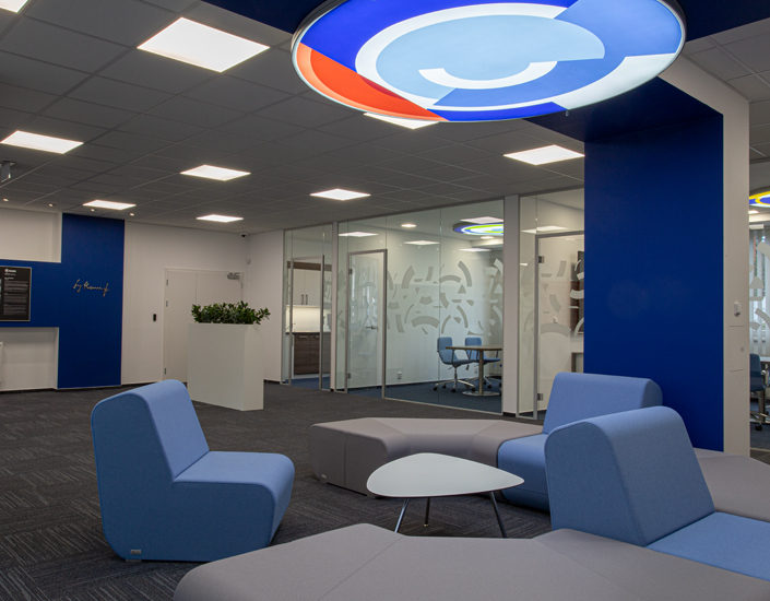
Then it was just a step to expressing it in a new corporate identity. We followed the inspiration of František Kupka's work and created a unique, evolving visual system, which, in addition to standard tools such as the website or merchandise, was also reflected in the new design of the lobby at the company's headquarters.
Once again, the brand proved to be the perfect means of connecting the external and internal worlds of the company.
